





아크릴 시트의 응용 분야: 혁신과 산업 변화
소개 광학적 선명도(92% 광투과율)와 다용도로 인정받는 아크릴 시트는 항공우주에서 의료에 이르기까지 다양한 산업에 혁신을 일으키고 있습니다. 글로벌 시장이 예상되는 가운데...
파스텔 아크릴 시트 이 제품은 주로 부드러운 채도, 반투명함, 그리고 빛을 받은 듯한 시각적 효과 면에서 일반적인 유색 아크릴과 차별화됩니다.
일반적인 유색 아크릴은 대개 색상의 선명함을 더욱 강조하는 반면, 파스텔 아크릴은 더 부드럽고 분위기 있는 느낌을 주는 디자인에 더 적합합니다.
장식용 조명의 경우, 색상만으로는 성능을 결정할 수 없습니다. 광투과율, 헤이즈, 확산도, 두께, LED 배열 등이 모두 최종 결과에 영향을 미칩니다.
적절한 반투명 아크릴 시트 원하는 외관과 조명 구성 모두를 고려하여 선택해야 합니다.
파스텔 아크릴과 일반 유색 아크릴의 차이는 시트에 색상이 표현되는 방식에서 비롯됩니다. 표준 컬러 아크릴 시트 생생한 색상, 짙은 색상, 투명한 색상, 반투명한 색상 또는 불투명한 색상으로 제작될 수 있습니다. 파스텔 아크릴은 시각적으로 다른 방향을 지향합니다. 색상이 더 부드럽고 시각적 강도가 낮으며, 전체적으로 더 가벼운 인상을 주도록 설계되었습니다.
파스텔 색상은 일반적으로 시각적 강도가 낮은 것으로 여겨집니다. 연분홍, 민트 그린, 베이비 블루, 라벤더, 크림색 등은 채도가 높은 빨강, 파랑, 초록 또는 기타 강렬한 색상보다 더 은은하게 보일 수 있는 색조의 예입니다.
이 차이는 시트에 빛이 비춰질 때 더욱 두드러집니다. 색상이 진한 아크릴은 선명하고 대비가 강한 느낌을 주는 반면, 파스텔 톤의 표면은 광원과 색상이 조화를 이루어 더욱 부드러운 효과를 연출할 수 있습니다.
파스텔 아크릴의 매력은 단순히 밝은 색조에만 있는 것이 아니라, 채도와 반투명함 사이의 미묘한 균형에 더 크게 있습니다.
반투명성은 재료가 빛을 투과시키면서도 시트를 통해 내부가 선명하게 보이지 않게 하는 특성을 말합니다. 장식용으로는 시트가 빛을 통과시키면서도 보이는 색상을 유지할 수 있기 때문에 반투명성이 유용할 수 있습니다. 최종적인 외관은 조성, 두께, 표면 마감 처리 및 광원에 따라 달라집니다.
이 때문에 비슷한 색상의 두 장의 종이가 백라이트를 비추면 상당히 다르게 보일 수 있습니다.
광투과율은 물질을 통과하는 빛의 양을 나타내는 반면, 헤이즈는 빛의 산란 정도를 나타냅니다. ASTM D1003 표준은 투명 플라스틱의 헤이즈 및 광투과율 측정을 구체적으로 다루고 있으며, 이러한 측정값이 품질 관리 및 재료 사양 설정에 유용하다고 명시하고 있습니다.
이 관계를 이해하는 데 도움이 되는 방법은 다음과 같습니다:
LED 광원 → 아크릴 시트 → 투과 + 산란 → 발광 표면
투과율이 높을수록 더 많은 빛이 통과할 수 있지만, 투과율만으로는 조명이 비추는 표면이 균일하게 보일지 여부가 결정되지 않습니다. 확산, LED 간격, 시트 두께, 그리고 LED와 시트 사이의 거리도 결과에 영향을 미칩니다.
재료에 빛을 비추면 파스텔 색상의 아크릴과 일반 색상의 아크릴 사이의 차이가 더욱 뚜렷하게 드러납니다.
시각적으로 강렬하고 눈에 잘 띄는 색상을 표현하고자 할 때, 표준 색상의 아크릴을 사용하는 것이 좋은 선택이 될 수 있습니다. 이는 색상 대비가 중요한 간판, 브랜드 디스플레이, 소매용 그래픽 및 장식 요소 등에 유용합니다.
파스텔 아크릴은 다른 디자인 원칙을 따릅니다. 색상은 그대로 드러나지만, 전체적인 느낌은 더 부드럽고 시각적으로 덜 강렬하게 다가올 수 있습니다. 따라서 조명 자체가 실내 공간의 분위기를 조성하는 데 기여하도록 의도된 경우에 적합합니다.
이 차이점은 다음과 같이 요약할 수 있습니다:
| 설계 우선순위 | 파스텔 아크릴 | 표준 색상 아크릴 |
| 색상 외관 | 부드럽고 은은한 | 강렬하고 생생한 |
| 시각적 분위기 | 부드럽고 은은한 | 대담하고 선명한 |
| 장식 조명 | 분위기 연출에 적합합니다 | 더 강렬한 색상 효과를 내기에 적합합니다 |
| 주요 디자인 중점 사항 | 색상과 조명의 조화 | 색상 정의 |
| 일반적인 선정 이유 | 부드러운 시각적 특징 | 강렬한 색감 |
일반적인 유색 패널은 주로 색상을 제공하거나 내부 부품을 가리는 역할을 합니다. 반면 파스텔 색상의 시트는 부드러운 색상의 표면과 투과되는 조명을 결합하여 조명 기구의 시각적 언어의 일부가 될 수 있습니다.
이러한 구분은 조명이 단순히 밝기를 제공하는 것 이상으로 분위기를 조성해야 하는 인테리어 프로젝트에서 특히 중요합니다.
파스텔 색상이 반드시 LED 확산 효과가 더 뛰어나다는 식으로 단정해서는 안 됩니다. 파스텔 색상의 시트는 시각적으로 부드러운 느낌을 줄 수 있지만, LED 핫스팟 제어는 이와 별개의 광학적 고려 사항입니다.
개별 LED가 아크릴 표면에 너무 가까이 배치되면 광원이 그대로 보일 수 있습니다. 거리를 늘리거나, LED 간격을 조정하거나, 적절한 확산 수준을 선택하거나, 시트 두께를 조절하면 더 균일한 외관을 연출하는 데 도움이 될 수 있습니다.
미국 에너지부(DOE)는 또한 조명기구의 전반적인 성능이 LED 소자뿐만 아니라 조명기구의 광학적, 열적, 기계적, 전기적 설계에 달려 있음을 강조하고 있습니다. 즉, 아크릴은 전체 조명 시스템의 한 부분으로서 평가되어야 합니다.
파스텔 아크릴은 장식용 벽 패널, 가구 포인트 장식, 조명 디스플레이, 인테리어 요소, 장식용 비품 및 은은한 색감 효과를 원하는 기타 프로젝트에 활용할 수 있습니다.
특히 소매점 인테리어, 호텔 및 레스토랑 등 접객 시설, 주거 공간 인테리어, 전시회, 창의적인 설치 미술 작품과 같은 공간에서 뛰어난 효과를 발휘할 수 있습니다. 이러한 용도에서는 대개 소재의 외관과 조명 사이의 균형을 맞추는 것이 목표입니다.
프로젝트에 선명한 색상, 강한 대비 또는 명확한 브랜드 인지도가 필요한 경우, 일반 유색 아크릴을 사용하는 것이 더 적합할 수 있습니다.
예를 들어, 특정 기업 색상을 재현해야 하는 발광 간판의 경우, 부드러운 파스텔 톤의 느낌보다는 색상 표현의 정확성을 우선시할 수 있습니다. 아크릴이 뚜렷한 시각적 경계를 만들어야 하는 디스플레이에도 마찬가지입니다.
만약 가장 큰 과제가 빛이 패널을 통과하는 방식을 조절하는 것이라면, 색상만으로는 선택 기준이 되어서는 안 됩니다. A 반투명 아크릴 시트 또한 투과율, 헤이즈, 두께 및 LED 배열과의 호환성에 대해서도 평가해야 한다.
B2B 조명 프로젝트의 경우, 선정 과정은 다음 네 가지 기본 단계를 따를 수 있습니다:
이러한 접근 방식은 쇼룸 조명 아래에서는 괜찮아 보이지만 완성된 조명 기구에서는 전혀 다른 효과를 내는 재료를 선택할 위험을 줄여줍니다.
다음 사항에 대해 제공 가능한 정보를 문의해 주십시오:
ASTM의 플라스틱 시험 체계는 광 투과율과 헤이즈를 측정 가능한 광학적 특성으로 간주하므로, 이러한 수치들은 “부드럽다”거나 “밝다”와 같은 주관적인 설명보다 기술적 비교에 더 유용합니다.”
두께는 기계적 취급과 재료를 통과하는 광학 경로 모두에 영향을 미칩니다. 따라서 두께는 계획된 절단, 천공, 굽힘, 연마 또는 접착 공정과 함께 고려해야 합니다.
CNC 또는 레이저 절단이 포함된 프로젝트의 경우, 구매자는 선택한 등급이 예정된 가공 방식과 호환되는지 여부를 반드시 확인해야 합니다.
표면이 노출되는 곳에서는 장식용 아크릴이 자주 사용됩니다. 따라서 흠집, 오염 또는 접착제 잔여물이 완성된 외관에 영향을 미칠 수 있습니다.
특히 대량 국제 주문의 경우, 출하 전에 보호 필름, 신중한 적재, 모서리 보호 및 적절한 수출 포장 방법에 대해 논의해야 합니다.
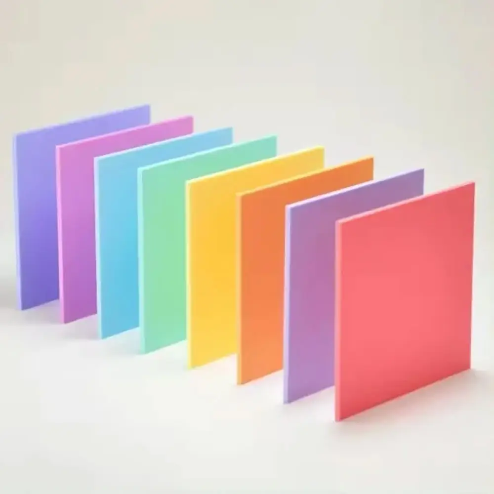
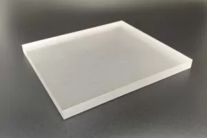
JRT의 파스텔 아크릴 시트(젤리 라이팅 아크릴 시트라고도 함)는 부드러운 마카롱 스타일의 색상과 무광 또는 새틴 마감 표면을 특징으로 합니다. 제공되는 색상으로는 라이트 핑크, 민트 그린, 베이비 블루, 라벤더, 크림 등이 있으며, 맞춤형 파스텔 톤도 제작 가능합니다.
| 사양 | JRT 파스텔 아크릴 시트 |
| 재료 | 100% 순수 PMMA 아크릴 |
| 두께 | 1–20 mm, 사용자 지정 가능 |
| 표준 크기 | 1220 × 2440 mm; 865 × 1977 mm |
| 색상 | 연분홍, 민트 그린, 베이비 블루, 라벤더, 크림색, 맞춤형 파스텔 톤 |
| 표면 | 무광 / 새틴 |
| 투광률 | 75–85% |
| 처리 | 절단, 드릴링, 굽힘, 연마, 접착 |
이러한 특성 덕분에 이 소재는 부드러운 색감과 투과광이 필요한 장식 프로젝트에 적합합니다. 제조사는 실내 장식, 가구 포인트 장식, 예술 설치물, 전시대, 간판 및 기타 창의적인 용도 등을 적용 분야로 제시하고 있습니다.
그러나 조명 프로젝트의 경우, 표기된 75–85% 광투과율을 모든 조명 기구에서 균일한 LED 조명이 보장된다는 의미로 해석해서는 안 됩니다. 실제 결과는 여전히 LED 광원, 간격, 설치 깊이, 시트 두께 및 광학 설계에 따라 달라집니다.
따라서 B2B 구매자의 경우, 대량 생산에 들어가기 전에 필요한 색상과 두께의 샘플을 요청하고, 사용 예정인 광원을 사용하여 테스트한 뒤 외관을 확인하는 것이 실용적인 평가 방법입니다.
A: 가장 큰 차이점은 색채의 채도가 더 부드럽고, 반투명하며, 표면 질감이 다르며, 재료가 투과광과 상호작용하는 방식에 있습니다. 파스텔 아크릴은 일반적으로 더 부드러운 시각적 효과를 내기 위해 사용되는 반면, 일반 유색 아크릴은 색상이 더 선명하게 표현됩니다.
A: 꼭 그렇지는 않습니다. “파스텔”은 시각적인 색상을 나타내는 반면, “반투명”은 빛이 재료를 통과하는 방식을 의미합니다. 파스텔 색상의 시트도 반투명한 특성을 가질 수 있지만, 이러한 특성은 구체적인 등급을 통해 확인해야 합니다.
A: 아닙니다. 핫스팟의 가시성은 광학적 확산은 물론 LED 간격, 설치 거리, 시트 두께 및 광원에 따라 달라집니다. 최종 자재 승인 전에 실제 조명 테스트를 실시하는 것이 좋습니다.
A: 명시된 광투과율은 75–85%입니다. 그러나 조명이 켜진 패널의 실제 외관은 두께, 색상, LED 광원 및 조명 기구 설계에 따라 달라질 수 있습니다.
A: 필요한 색상, 두께, 치수, 투광률 정보, 표면 마감, 제작 요구 사항 및 견본을 요청하십시오. 반복 OEM 주문의 경우, 색상 일관성도 확인해야 합니다.
파스텔 아크릴이 다른 점은 단순히 색상이 더 연다는 것만이 아닙니다. 이 재료의 독특한 가치는 부드러운 색감 표현, 반투명함, 표면 마감, 그리고 투과되는 빛이 서로 어우러지는 데서 비롯됩니다.
강렬한 색상과 시각적 대비가 중요한 경우, 일반 색상의 아크릴은 여전히 실용적인 선택입니다. 프로젝트에서 시트와 조명이 조화를 이루며 부드러운 장식 효과를 연출해야 할 때는 파스텔 톤의 아크릴이 더욱 매력적인 선택이 됩니다.
장식용 조명이나 인테리어 프로젝트를 위해 JRT 파스텔 아크릴 시트를 조달하고 계신다면, 문의하기 필요한 색상, 두께, 시트 크기, 조명 구성 및 수량을 알려주시면 적합한 구성에 대해 논의하고 견적을 요청해 드리겠습니다.
 159월
159월
 159월
159월
 1710월
1710월
 2310월
2310월